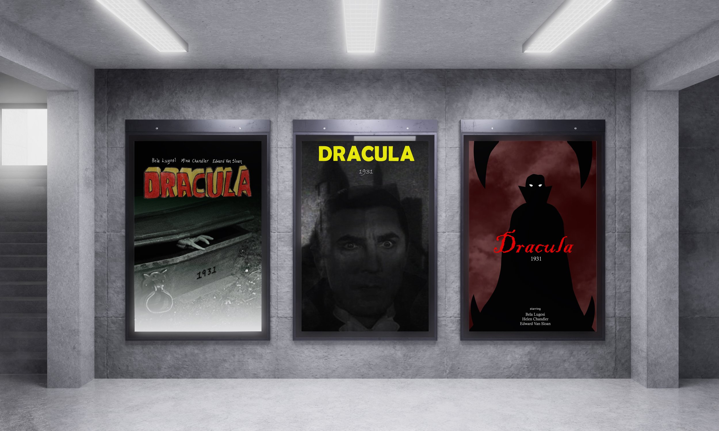
Movie Posters (Type 2)
I had to design three different posters based on a certain movie. The typeface for one poster had to be hand drawn. The movie that I decided to base my designs around was Dracula 1931. The movie was shot in black and white and used a lot of the same backdrops for different scenes. So, the movie was very simple and I wanted to replicate this. For the first poster from the left, I showed Dracula rising from his coffin. I put a gradient over the image to show that the light of day is descending and night is rising. All the type on this poster is hand drawn, and I wanted to mimic the style used at that time. For the second poster, I overlayed two pictures from the movie because I wanted to play a trick on the viewers’ eyes. I chose Dracula’s castle and his face. Dracula is not as opaque as the castle behind him because he is a vampire. I emphasized light beaming on his eyes to show he is looking for his next victim. I used a bold typeface and the color yellow for the title to attract attention. In the last poster, I used illustration to convey this movie. Dracula is usually stalking his prey in a mysterious, eerie night. I portrayed this by having Dracula’s silhouette prominent in the center of the poster with his glowing white eyes. I created a red gradient on top of an image of a dark sky to show a gloomy night as the background. I then added fangs around Dracula to capture him biting into his victim. His bottom teeth also became a ledge that he is standing on. I used a thin and curvy typeface for the title to convey blood.
