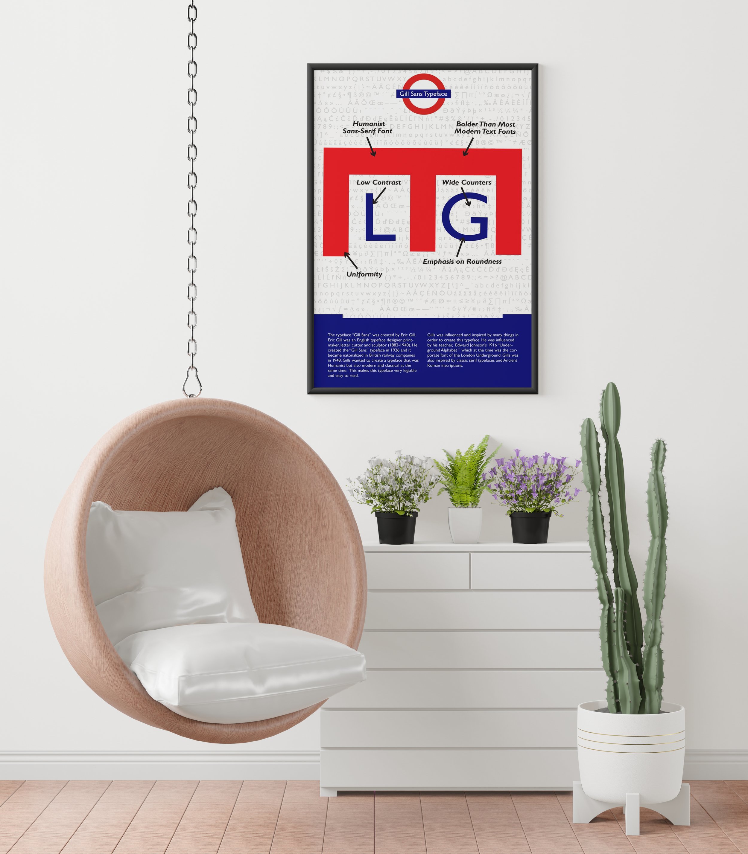
Gill Sans Typeface Poster (Type 1)
I had to create a poster about a certain typeface and show its characteristics. The typeface I chose to convey was Gill Sans ,which was created by Eric Gill. The characteristics of this typeface are uniformity, emphasis on roundness, low contrast, wide counters, bolder than most modern text fonts, and is a Humanist Sans-Serif Font. When I was designing this poster, I wanted the poster to have an Underground/Subway feel since that is where this typeface originated from. I put the glyphs in the background to create an aesthetic of writing on the wall that you would see in the subways. I took the London Underground Logo and placed the text “Gill Sans Typeface” at the top of the poster to let my viewers know what the poster is about. I chose the specific letters of E, L, and G to stand for Eric Gill and London. I positioned the E facing down where the E looks like a tunnel and I put the letters L and G in the counter spaces of the E to make the L and G look like trains. I included the history of this typeface on the bottom of the poster. This was designed using Adobe Illustrator.
