

Type Anatomy (Design 1)
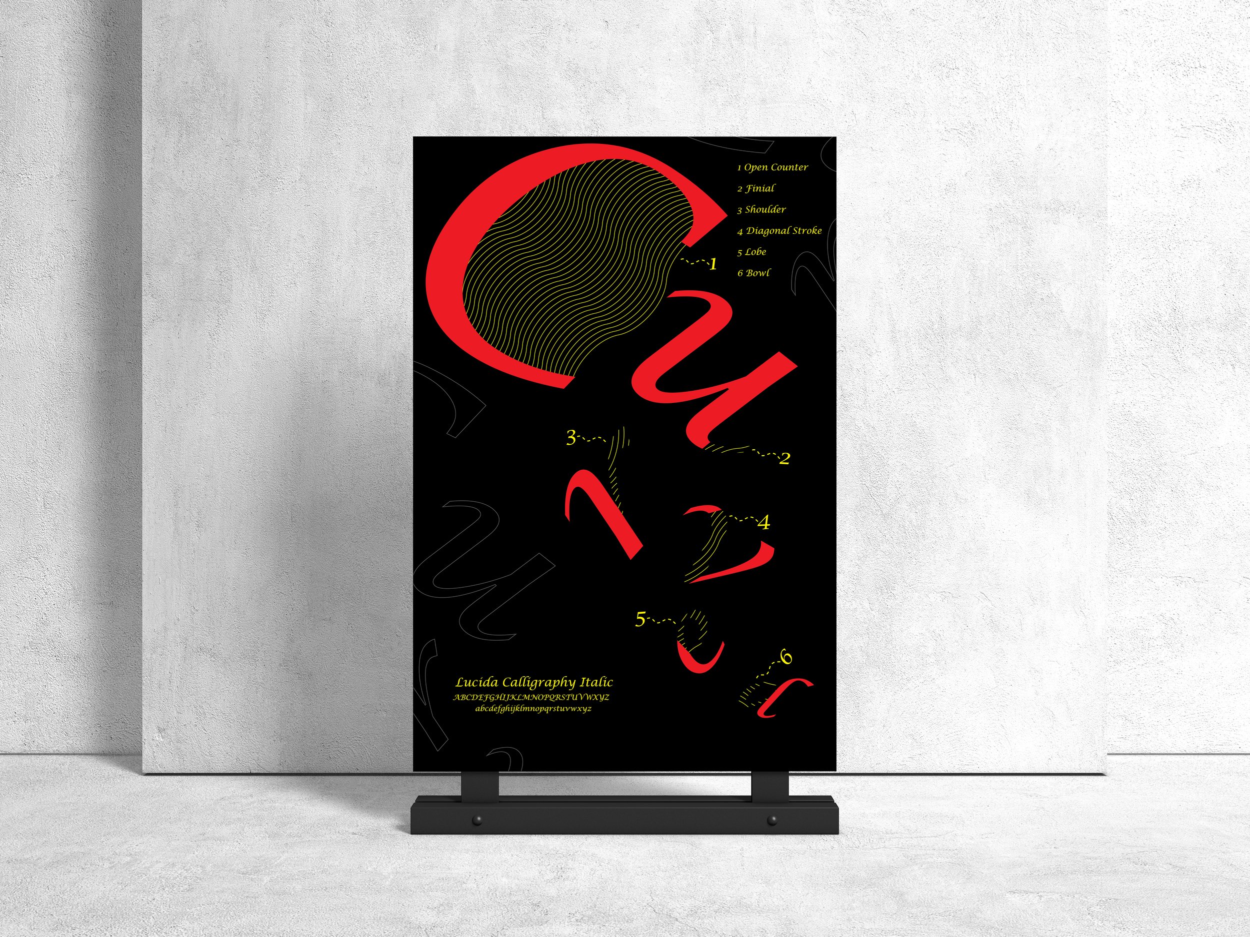
I had to design a typographic poster that highlighted the anatomy of the typeface which I chose, Lucida Calligraphy Italic. The design of the poster had to match the meaning of the selected word…“Curved.” I stuck to an eye-catching palette which primarily consisted of black, yellow, and red. I positioned each letter of the word “Curved” in a curved path. I designed this in Adobe Illustrator.
